All of the data is collected on the page load. If it is missing today's data, the code calls out to Zendesk for tickets at that time, saves the data to SharePoint and then calls out to SharePoint to get all of the historical data. I chose to use HighCharts to display the data since it offers a great product for graphing.
As the data are on vastly different scales, I use one scale on the left for average area status (out of 100%), and I use the right side for a count of tickets which can go into the hundreds. I just started collecting the ticket data, so that is why there are a bunch of zeros in the past for this screenshot.
First, here is a screenshot:

You may have noticed that I have customized the masterpage for this site in SharePoint.
Additionally, I have modified the data entry page for the status input each morning. I have a PowerShell script running on the SharePoint server that creates new blank fields for status input so when the manager calls up the page, it looks like this:

Data entered into this page is saved to the SharePoint list where the page will use for the chart later with a REST call to SharePoint.
The page is built Responsively, so this can be viewed on a mobile device quickly by a director should he need to know system status. Below is how the page renders on a smaller device:

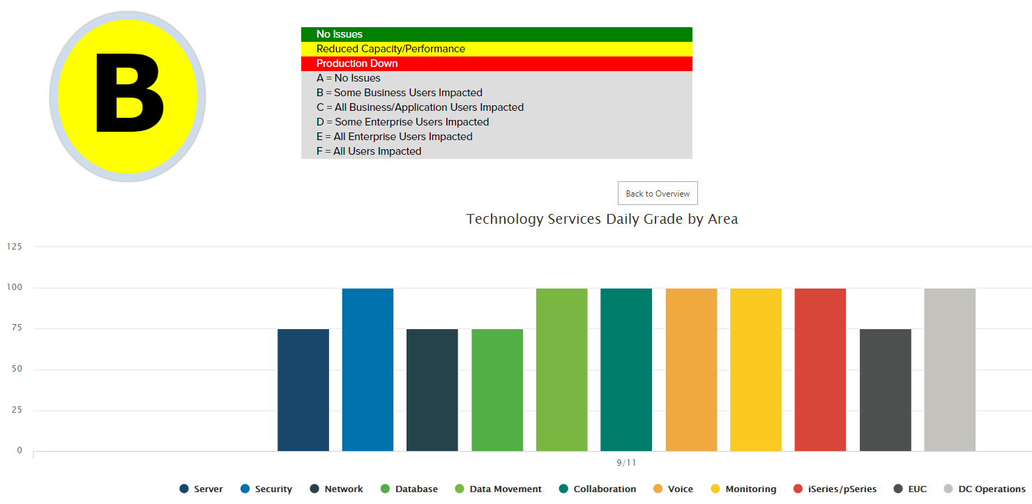
Clicking the "Big Button" will call some javascript to pop out detailed data about each area of the department:


I will post some of the code later this week, if any of you are interested and want to try this.
Series Links
No comments:
Post a Comment